When it comes to branding, a logo serves as the cornerstone of a company’s visual identity.
For designers and businesses alike, understanding what makes a great logo is crucial.
A well-crafted logo not only captures attention but also communicates the essence of a brand at a glance.
A well-designed logo goes beyond mere aesthetics. It encapsulates the identity, values, and mission of the brand it represents.
Its significance in branding cannot be overstated; it's the visual shorthand for a company's reputation and promise to its customers.
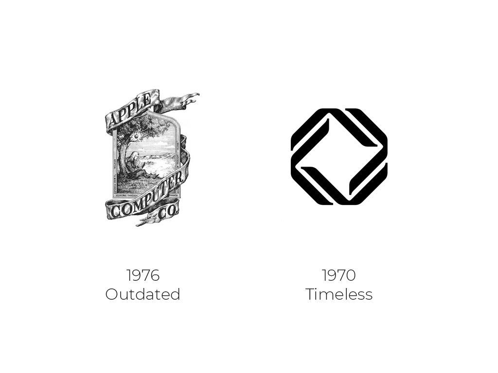
But what transforms a simple design into a powerful branding tool?
It all comes down to three core principles that every logo should embody: appropriateness, memorability, and simplicity.
Let’s explore how these principles shape the foundation of a logo that resonates with its audience and stands the test of time.
Appropriateness
Designing a logo goes beyond aesthetics; it’s about creating a symbol that resonates with a brand’s essence and speaks directly to its target audience.
One crucial element in achieving this is ensuring that the logo is appropriate for the brand it represents.
For many new designers, this concept is often overlooked, yet it’s a core component of effective logo design, determining whether a logo connects with its intended audience and conveys the right message.
What Does It Mean for a Logo to Be “Appropriate”?
Let’s dive into this foundational design principle and see how it shapes a brand’s identity.
Understanding the Brand’s Personality
A brand’s personality is the foundation of the design. From color and typography to shapes and forms, every design choice should reflect the brand’s unique character.
Imagine trying to represent a children’s toy company with a logo that resembles a financial institution’s, this disconnect can be confusing and dilute the brand message.
Consider the following brand personalities:
- Playful and Energetic: brands operating within the realms of entertainment, children’s products, and casual food services often leverage bright colors, bold fonts, and friendly shapes to craft an inviting and engaging visual identity.
Bright colors like vibrant reds, cheerful yellows, and energetic blues draw attention and evoke positive emotions, making the brand more appealing and memorable.
Bold fonts enhance readability and add an element of playfulness, reinforcing the brand’s approachable nature.
Friendly shapes, such as rounded edges and whimsical designs, further contribute to a fun and welcoming atmosphere, ensuring that the brand resonates well with its target audience.
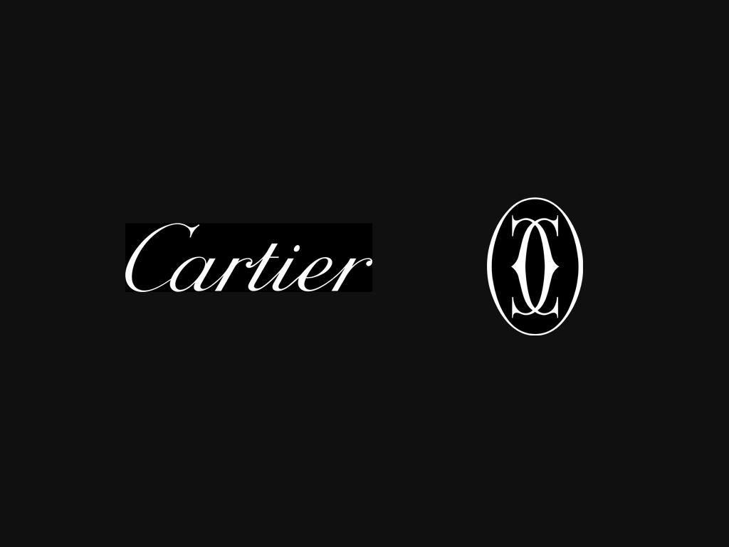
- Sophisticated and Elegant: Luxury goods, fashion, and high-end tech companies often rely on logos that embody clean lines, minimalist design, and subtle colors to communicate a sense of quality and exclusivity.
Clean lines create a sleek and modern aesthetic, reflecting the sophisticated nature of luxury brands. Minimalist designs strip away any unnecessary elements, ensuring that the logo remains elegant and timeless, which helps to cement the brand’s premium status.
Subtle colors, such as blacks, whites, and muted tones, further enhance this sense of refinement and understated luxury.
These design choices work together to project an image of exclusivity, precision, and top-tier quality, appealing to discerning customers who value premium products and services.
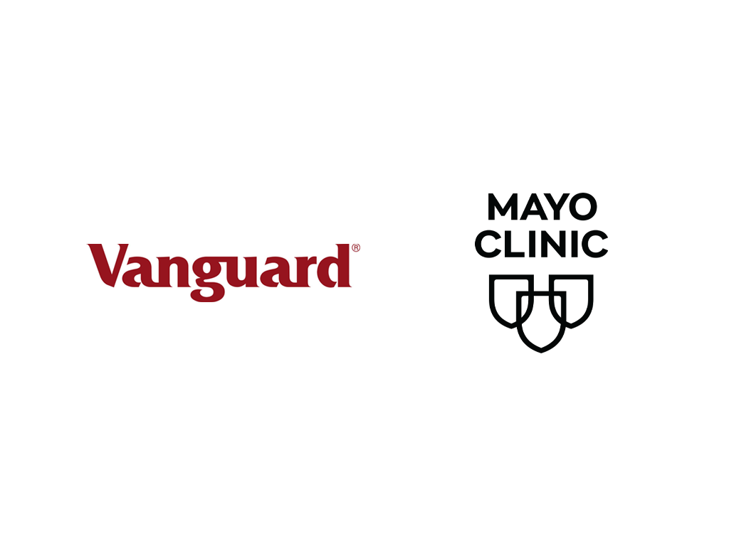
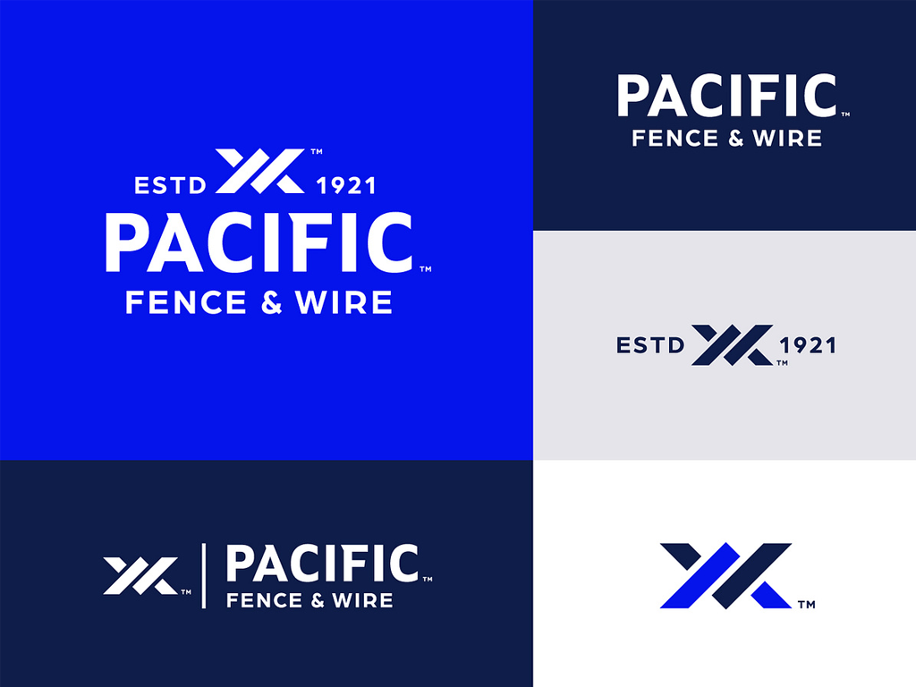
- Reliable and Trustworthy: Financial services, healthcare, and law firms often utilize traditional fonts and professional colors like navy or grey to communicate reliability and trustworthiness.
Traditional fonts convey a sense of stability and authority, which are essential qualities for industries that deal with sensitive and critical matters.
Professional colors such as navy and grey add to this perception by projecting an image of seriousness and dependability.
Additionally, the use of balanced shapes in their logos ensures a harmonious and organized appearance, further reinforcing the idea of precision and competence.
These design elements collectively help these firms convey a message of reliability and professionalism, instilling confidence in their clients and stakeholders.
Appropriateness here is about matching the design choices to the brand’s core personality.
Resonating with the Target Audience
Designing with the brand’s target audience in mind is essential to ensure the logo is relevant. Consider these audience-focused approaches:
- Younger Audiences: Brands targeting children or young adults should use lively colors, friendly fonts, and playful icons, which are more appealing to this demographic
- Professional Audiences: Consulting or financial brands benefit from logos that feel trustworthy and refined, often with classic color palettes and simpler, structured designs.
- Professional Audiences: Consulting or financial brands benefit from logos that feel trustworthy and refined, often with classic color palettes and simpler, structured designs.
Knowing the audience ensures the logo “speaks their language,” enhancing both relevance and appeal.
Communicating the Brand’s Purpose
A logo doesn’t need to explicitly show what a company does but should hint at the brand’s unique value.
Consider how Apple’s logo "a simple apple" reflects the brand’s focus on user-friendly, premium technology without showing literal tech symbols.
Designers can use different symbolic approaches:
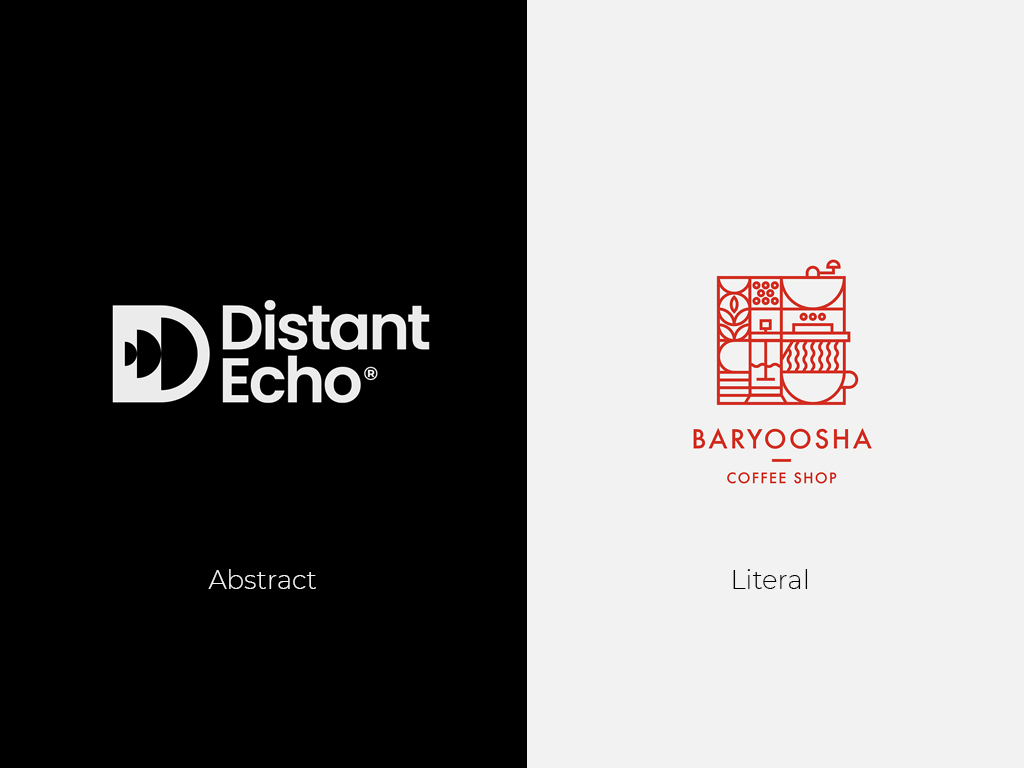
- Abstract Symbols: These are an effective way to convey innovation and creativity, making them ideal for tech and creative brands.
These symbols break away from literal representations, using geometric shapes, lines, and forms to create a unique visual identity that sparks curiosity.
Their versatility allows for easy adaptation across various media, from digital to print.
By inviting interpretation, abstract symbols engage audiences and communicate a forward-thinking, dynamic brand image, helping companies stand out in competitive markets.
- Literal Symbols: Literal symbols can be highly effective for certain brands by immediately conveying the nature of their business.
For instance, a bakery might incorporate a subtle icon of bread or a rolling pin into its logo.
These symbols are straightforward and instantly recognizable, helping customers quickly understand what the brand offers.
Literal symbols can also evoke specific feelings or memories associated with the product, such as the warmth and comfort of freshly baked bread.
This approach is particularly useful for businesses that want to communicate their offerings directly and clearly to their audience, ensuring there is no ambiguity about what they do.
The goal is to strike a balance—giving a nod to the brand’s purpose without limiting its growth.
Reflecting Industry Standards
Each industry has design trends that serve as guidelines, yet effective logo design combines these with unique elements for memorability.
Take Google’s logo, for instance: it uses primary colors but in a playful arrangement, reflecting both familiarity and innovation
An effective logo balances industry standards with distinctiveness, helping the brand stand out.
The Timelessness of Appropriateness
Trends come and go, but a logo that is truly appropriate to a brand’s essence is likely to remain relevant.
While tempting, trend-driven designs can quickly become outdated, while an appropriate design that aligns with the brand’s personality, audience, and purpose is more likely to stand the test of time.
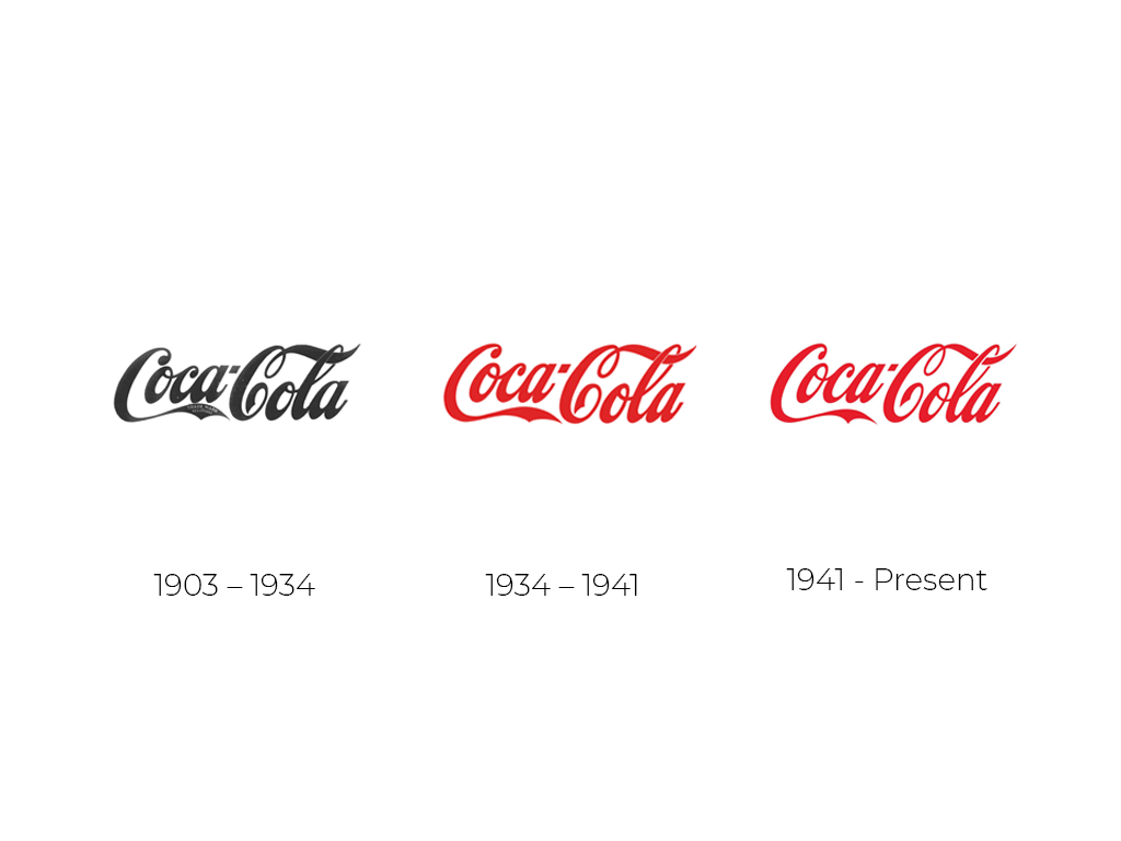
Consider Coca-Cola’s logo, which has remained largely unchanged since its creation. Its flowing script captures a sense of heritage and quality that continues to resonate today.
A genuinely appropriate design creates longevity for the brand.
It doesn’t just look good, it connects, communicates, and captivates.
By focusing on appropriateness, designers ensure their logos accurately represent the brand’s personality, resonate with its target audience, and subtly communicate the brand’s purpose.
The most effective logos are more than fitting—they’re a natural extension of the brand, telling its story in a single, memorable image.
Memorability
In today’s saturated market, standing out is essential. A distinctive logo helps a brand break through the clutter, making it easy to recognize and remember. But what does it take to create a logo that’s truly distinctive and memorable?
The Value of Uniqueness
Uniqueness is the cornerstone of memorability. Aim to create a design that captures the brand’s character in a fresh, innovative way.
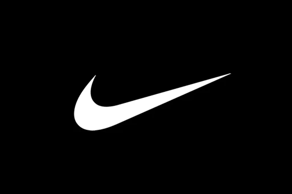
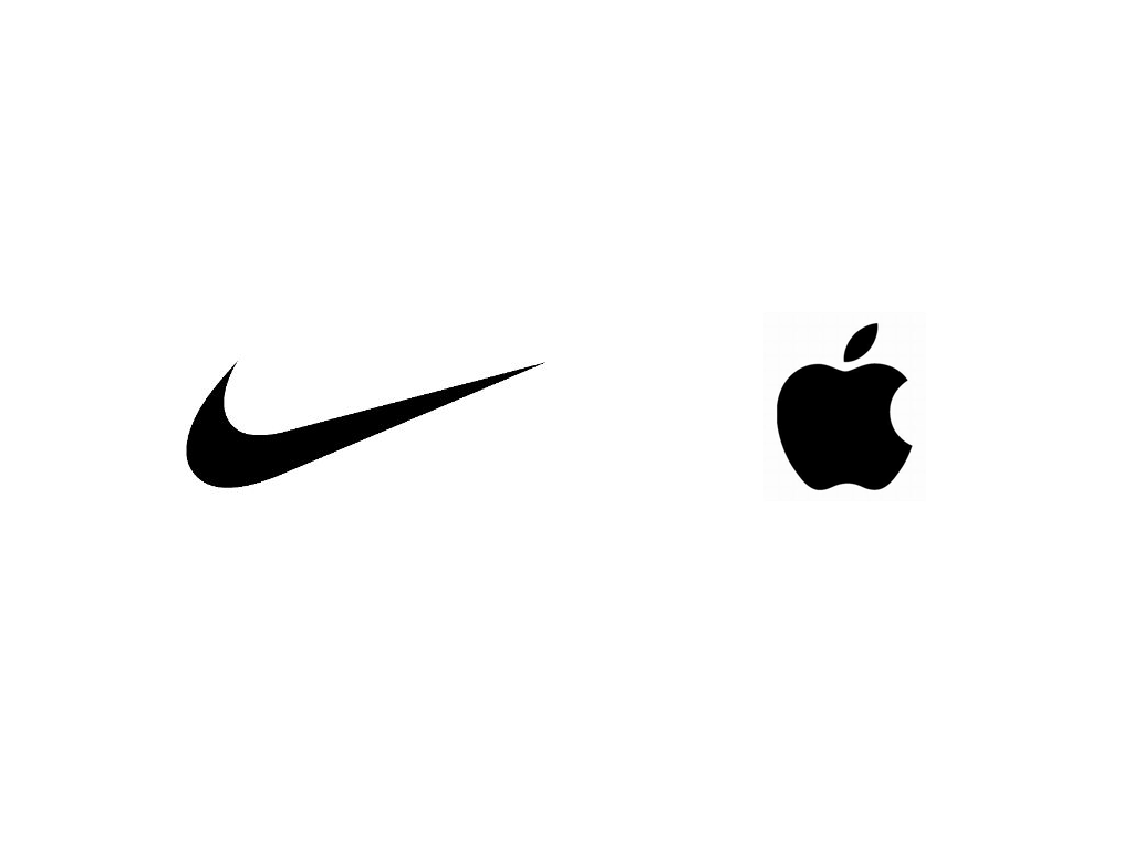
- Original Design Elements: Avoid clichés and embrace creative shapes or unique icons, like Twitter’s bird or Nike’s swoosh.
- Unexpected Choices: Use unique elements, like an unconventional color palette or playful shapes, to create a fresh design while still fitting the brand.
The Role of Color in Memorability
Color is a powerful element that improves brand recognition. Here’s how to leverage it:
- Choosing a Cohesive Palette: Stick to one or two main colors for focus, like Coca-Cola’s red.
- Bold Contrasts: High-contrast colors help the logo pop and stay memorable.
Typography that Leaves an Impression
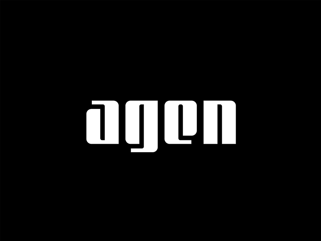
Typography can make a logo instantly recognizable. Custom typefaces or unique modifications add personality and make the logo feel exclusive.
- Custom Typefaces: Custom typefaces are a powerful tool in logo design, creating a distinct and memorable brand identity.
Unique fonts, like the one used in Disney’s logo, become instantly identifiable, setting the brand apart from others.
These custom typefaces convey the brand’s personality and ethos, making a lasting impression. For Disney, the whimsical and magical feel of its custom font perfectly encapsulates the brand’s essence, appealing to both children and adults.
- Consistency and Legibility: Balancing creativity with readability ensures that a logo not only stands out but is also easily understood and recognized by the audience.
Consistency in design elements such as color schemes, typography, and overall style helps to reinforce brand identity and build trust over time.
Legibility is equally important, as a logo that is difficult to read can confuse potential customers and diminish brand clarity.
By combining creative elements with clear, readable fonts and harmonious design, brands can create logos that are both visually appealing and functional.
Maintaining Consistency
The logo's memorability and effectiveness heavily rely on its consistent application across different platforms.
Consistent use helps reinforce brand recognition, ensuring that the logo becomes synonymous with the brand in the minds of the audience.
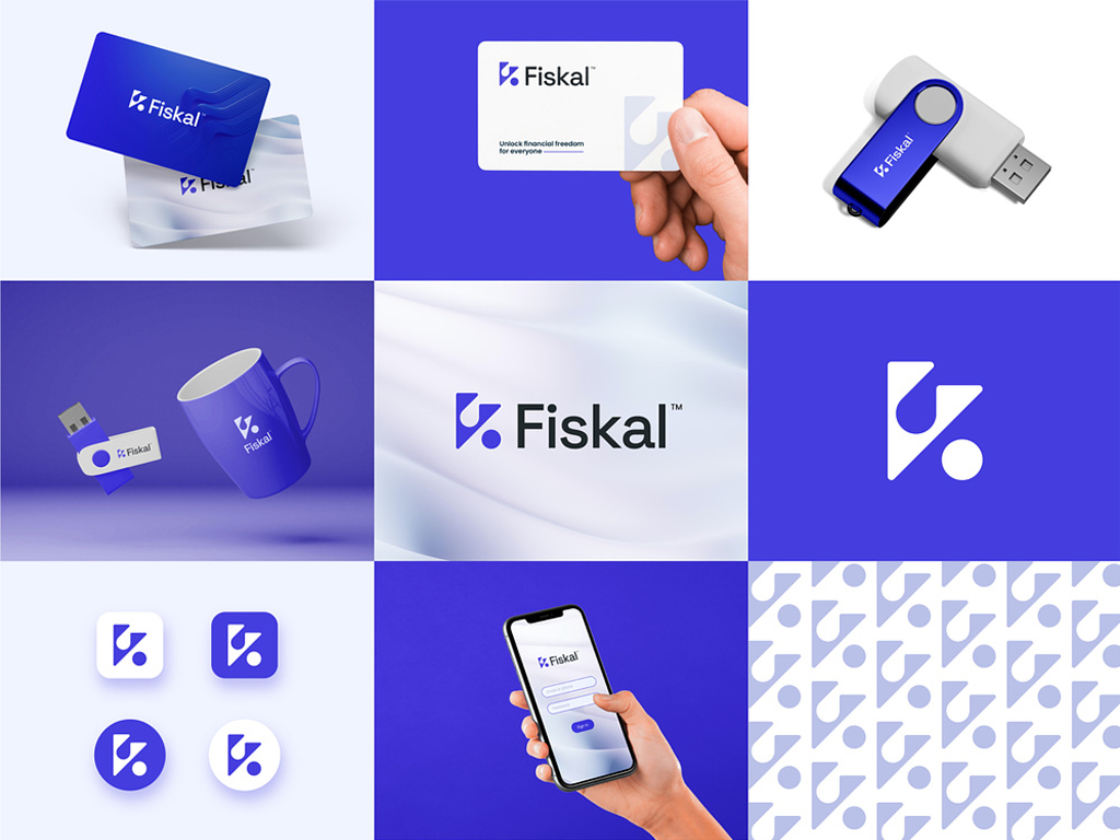
- Design Variants: Creating adaptable logo versions for different uses is crucial in maintaining consistency while allowing flexibility.
For instance, a main logo might be detailed and colorful, suitable for use on websites and printed materials.
However, a simplified icon variant can be created for smaller applications like app icons or social media profiles.
This approach ensures that the logo maintains its integrity and recognizability regardless of where it appears.
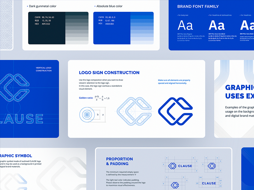
- Clear Guidelines: Using brand guidelines is essential to maintain uniformity across all applications.
These guidelines should outline how the logo can and cannot be used, including specifications on colors, fonts, spacing, and positioning.
Brand guidelines serve as a rulebook for anyone creating materials that feature the logo, ensuring that the logo is always presented in a way that is consistent with the brand’s image.
This helps prevent any variations that could dilute the brand’s identity and confuse the audience.
A memorable logo builds brand recognition and loyalty.
By focusing on originality, color, typography, and consistency, you can design logos that make a lasting impression.
Simplicity
Simplicity in logo design enhances recognizability, versatility, and timelessness.
Let’s explore why simplicity is a core principle for creating impactful logos.
Instant Recognizability
A simple logo is easier to recognize, even at a glance.
This instant recognizability helps in making a strong first impression and aids in building brand recall.
When a logo is simple, it becomes more memorable because our brains find it easier to process and store uncomplicated shapes and designs.
Versatility Across Platforms
Simplicity allows logos to adapt to different sizes and contexts seamlessly.
Whether it's on a tiny business card or a massive billboard, a simple logo maintains its integrity and impact.
Minimal detail ensures that the logo remains clear and legible at any size, making it versatile for various applications, from digital to print media.
Timeless Appeal
Simplicity helps logos avoid trend-based designs that quickly become outdated.
A timeless logo focuses on classic elements that maintain their appeal over years or even decades.
By steering clear of passing trends, a simple logo remains relevant and effective, helping to establish a long-lasting brand identity.
Clear Communication of Brand Message
Simplicity aids clarity by focusing on the primary symbol, shape, or text that captures the brand’s essence.
A simple logo eliminates unnecessary complexity, making the core message of the brand more accessible and understandable to the audience.
This clear communication helps in effectively conveying the brand’s values and identity at a glance.
Simplicity enhances a logo’s effectiveness, adaptability, and longevity. The best logos are straightforward and impactful, leaving a powerful and memorable impression.
conclusion
A great logo is far more than just a visual element; it is the foundation of a brand’s identity and plays a crucial role in shaping the way a company is perceived.
By focusing on three core principles: appropriateness, memorability, and simplicity, designers can create logos that not only capture attention but also convey the essence of the brand in a way that resonates with the audience.
A logo that is appropriate reflects the brand's personality and values, a memorable logo helps the brand stand out in a crowded market, and a simple logo ensures long-lasting recognition and versatility across platforms.
Ultimately, a well-designed logo is one that tells a compelling story, stands the test of time, and becomes an iconic symbol that customers can connect with, trust, and remember.